Everything you should put on a business card (and what to leave off!)
Everything you should put on a business card (and what to leave off!)
In a time when digital gadgets reign supreme, there’s one classic networkers' tool that is still relevant despite its vintage roots. We’re talking about the humble business card, and its still one of the most important marketing and networking tools today. When done well, a business card will showcase a brand, add legitimacy to a business, and give a person everything they need to contact someone quickly and easily (without asking Siri or Google for help!)
Logo
This one’s kind of a no-brainer, but we couldn't leave it off the list. A logo is tied strongly to brand and should be on most, if not all, marketing material. Even though we’re dealing with a small area, make sure your image files are still high res - blurred, stretched or distorted logos are not a good look! Ask the client for their brand and logo guidelines, and make sure you respect them, your client will thank you for it.
Tagline or slogan
We want to be clear about what a business does. Do they have a catchy tagline or slogan? Don’t keep that good stuff all to yourself, share the love and display it on the card. A tagline carries a lot of value - it's usually memorable and it conveys a brand promise. A good one tells you exactly what a company is good at, and what you can expect when you engage with that business.
Company name
Again, this one’s pretty obvious. Company name is important for the reader, but if it’s already clear and distinguishable in the logo, there’s really no need to repeat it on the card. A business card is like a pocket-sized billboard, the simplest ones are always the most effective!
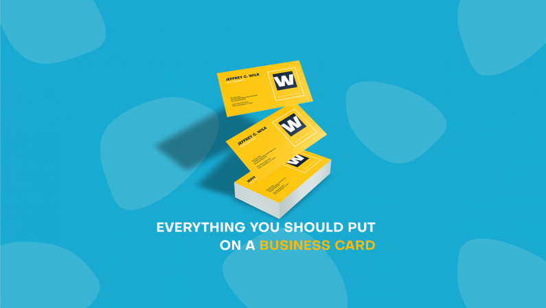
Name and job title
How many times have you met someone and instantly forgotten their name? We think this is one of the reason’s business cards will never go out of style. The heart of any business card is the person’s name, so make sure it stands out.
Contact details
These should be added in order of preference, so if the person spends all their time on email and hardly ever answers their phone, make sure you lead with the email address and display the phone number further down. Remember to add any relevant social media logos and details too!
Website
In the interests of keeping things simple, we recommend dropping everything off the url that isn’t important. So go ahead and drop the www from that website address, it will give you more space on the card, and we guarantee it won’t be missed (we’re all familiar with how the internet works by now!)
WHAT TO AVOID:
Excessive text
When people look at a business card, we don’t want them to feel like they’re watching Hoarders Buried Alive. Clutter and chaos do not belong here! Avoid overwhelming the card, and the person looking at it, by keeping it simple. Avoid excessive text and use lots of negative space.
Multiple Fonts
Likewise, using a variety of different fonts is unsightly and overwhelming. Nothing makes a card look unprofessional like a hodgepodge of mismatched fonts. Stick to 1 or 2 and use brand guidelines if the client has them. If not, choose a font for the client that is clear and easy to read.
Don’t over-egg the pudding
What we leave off a business card is almost as important as what we put on, so it’s wise to exercise some restraint. A good business card is clean, clear and succinct. It’s much easier to read and your client will thank you for it.
Happy designing!