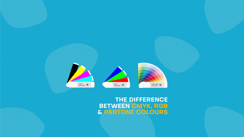
The difference between CMYK, RGB & Pantone colours
Pantone, CMYK, and RGB all have one thing in common: they’re used to determine and produce colour. Aside from that, the three are actually quite different. Let’s jump into it to find out why.
CMYK
Standing for Cyan, Magenta, Yellow, and Black (the K stands for Key, which is the printer’s term for black). CMYK refers to the colours that are traditionally used by an ink printer to produce colour. Printers create tiny dots of these 4 colours in a specific formula to create any colour imaginable! That’s why we often see our Production Team with an eyeglass up to your jobs, checking each finer detail.

RGB
RGB refers to Red, Green, and Blue and they’re the 3 colours used to produce everything you see on a screen. Whenever you look at a digital image, photo, or colour, on any kind of screen, you’re looking at a mixture of these 3 colours.
CMYK vs RGB
After reading these definitions you might still think they sound awfully similar but there are two critical differences between them:
-
RGB is for digital, and every colour will be changed into CMYK when you click print!
-
RGB colours are what we call additive shades, meaning light is added to get colour. Your computer screen is black before adding anything to it, and if each colour is boosted to 100%, the screen is white. CMYK colours are created by soaking up light on a piece of paper (or anything you’re printing on), which is why paper is white when nothing is added to it, and must have ink added for colour to appear.
So the same colour will look quite different on your screen versus on a printed item (not to mention the likely variations across everyone’s different screens!). It’s important to be aware of these differences and convert any RGB colours to CMYK before you print to avoid any nasty colour surprises!
But what about Pantone?
Pantone are known as the colour experts, and you might know them as the people who determine the colour of the year. Pantone Matching System (PMS) is a tool that allows you to select and reproduce pretty much any colour your heart desires, and will give you the ability to match it exactly every time.
Many designers prefer to use Pantone colours, even for printing, but there are a few things to consider when doing this. When you print in CMYK, you can use the standard combination of inks on a printing press, which are of course Cyan, Magenta, Yellow, and Black. But printing with a Pantone colour requires a little bit more effort, and a lot more expense. This is because Pantone colours are not a mix of your basic CMYK colours, but are a special colour on their own. To print with Pantone colours, the ink must be specially mixed, and a cartridge for that particular colour installed into a printer. Not only are the specially-made inks expensive, the process is time consuming, as the printer must be cleaned thoroughly before putting the new cartridge in.
Converting colours
You can of course convert colour codes into other codes, easily switching Pantone to CMYK to RGB with the use of free internet tools. But it is important to remember that converting Pantone to CMYK printable colours may result in something a bit different. Before clicking print, make sure you have looked at the conversion from Pantone to CMYK and are happy with how the colour will turn out. If you need help, just reach out to us! Our team knows colour inside and out and we’ll be able to help you get the exact colour you’re looking for.